




From Athens to Johannesburg: how a spontaneous showroom visit became an international collaboration.
MasterFold
in South Africa
MasterFold in South Africa
When the Right People Walk Through the Door :
How a Spontaneous Visit Became an International Collaboration
There is a Greek word that has no direct translation in any other language: philotimo. It speaks of honour, generosity and a deep sense of doing right by others, not because you must, but because it is simply who you are. It is the spirit behind everything Andria Neophytou and Alexis Christopher have built together under the Philotimo Group, one of South Africa’s most respected names in fine dining.
It is also, perhaps, the reason they walked through our door.
One afternoon, not on appointment but on instinct, Andria and Alexis visited our showroom. They were curious. They wanted to see, touch and feel what European luxury printing actually looked and felt like in person. What happened next became one of our most meaningful collaborations to date.
A Showroom Built to Tell a Story
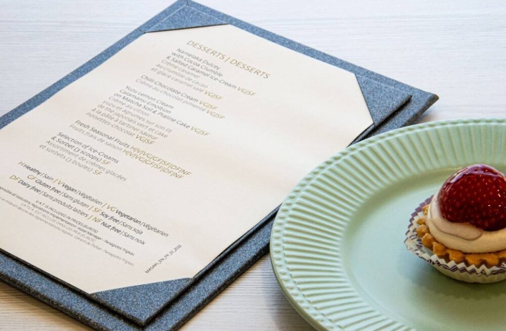
Our showroom exists for exactly this reason. It’s a space where materials come alive, where you can run your fingers across a cork surface, feel the weight of a handbound menu cover, study how a debossed logo catches light. Andria and Alexis spent time with us that day, moving through our full collection of restaurant hospitality products: menu covers, bill folders, server wallets, placemats and more. What drew them was the depth of what we could offer. A richness of materials, finishes and sustainable innovations that simply aren’t available outside of Europe.
They found what they were looking for and this is how everything began to flourish.
Why Philotimo Group Chose MasterFold
Trust in a new supplier isn’t given. It’s earned. Several things came together in that conversation that made the partnership feel right.
First, our portfolio spoke for itself. Years of crafting luxury hospitality products for restaurants and hotels across the world meant we already understood their language, the language of experience and detail.
Second, durability mattered. Restaurant products live hard lives. They are handled dozens of times a day, cleaned, stacked, set down in a hurry. We build for that reality without ever compromising on beauty.
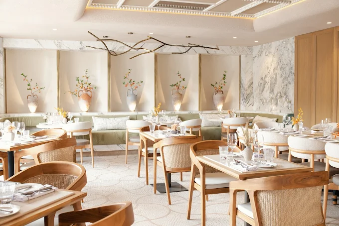
Third, and this was particularly meaningful for Mila, there was a genuine desire for a Greek touch. Mila Modern Greek is rooted in the spirit of the Aegean: in warmth, honest simplicity and the quiet elegance of Greek culture. It made perfect sense that the physical objects guests hold in their hands should carry that same origin. Products made in Greece, carrying Greek craftsmanship into the heart of Johannesburg.
And finally, sustainability. We work with innovative materials and applications, among them natural cork, recycled leathers and eco-conscious finishes from leading European suppliers that represent a new standard in responsible luxury printing. These are choices that make the finished product better.
Mila Modern Greek: Warmth, Philosophy and a New Identity
Our work with Mila began at a particularly exciting moment: a full rebrand. A rebrand is always the right time to rethink every physical touchpoint. The new brand identity arrived, warm yellows, deep oranges, midnight blue. A palette that captures Mediterranean sunsets, Aegean hospitality and something at once ancient and entirely fresh. Working from these guidelines, we developed bespoke pieces, each one designed to feel completely at home in Mila’s world.
The Food Menu Covers – A4 Format, Two Color
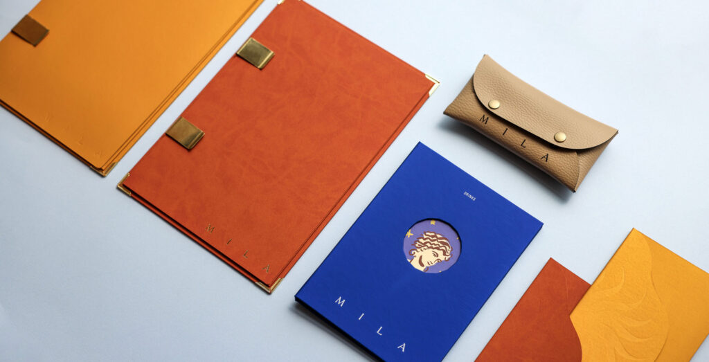
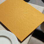
For the food menus, we worked with two premium cover materials: a warm sunny yellow and a rich tan orange, both laminated over a hard board structure that gives each cover its substance and weight. Pages are held in place by two refined gold clips, each one laser-engraved with Mila’s brand elements. They keep the interior, printed on 300 gsm premium semi-gloss paper, perfectly presented at all times. The Mila logo is debossed on the back cover, pressing softly into the material. Four golden corner protectors complete each piece, protecting against the wear of daily service.
The Bill Folders – In Yellow and Orange
Produced in the same materials as the menu covers, the bill folders carry the Mila palette through to the close of every meal. Each folder is cut in the form of a sun. Its interior is the sleeve into which the bill quietly slips. Its surface finished in hot stamping.
The Drinks Menu – Midnight Blue, with a Window to the Soul
The drinks menu takes on a smaller format, dressed in midnight blue. Its pages are bound with metal screws. The front cover features a precisely cut opening, a window, that reveals the design printed on the inner board beneath, giving the cover a quiet depth that draws the eye inward.
The Server Wallet – Recycled Leather, Made to Work
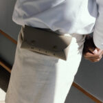
Completing the Mila collection is a server wallet in recycled leather, designed to be worn on the belt. It holds a pen, a notepad and any other essentials a waiter reaches for throughout a service, all within a single piece.
KōL Izakhaya: Precision, Restraint and the Elegance of Black Cork
Then came KōL.
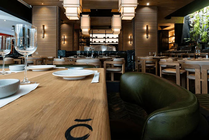
If Mila is warmth and light, KōL is something altogether different. Inspired by the Izakaya street culture of Japan and named after the kanji character for charcoal, the fuel that fires its kitchen, KōL is a study in atmosphere. Dark, focused, precise. A restaurant where every detail signals intent.
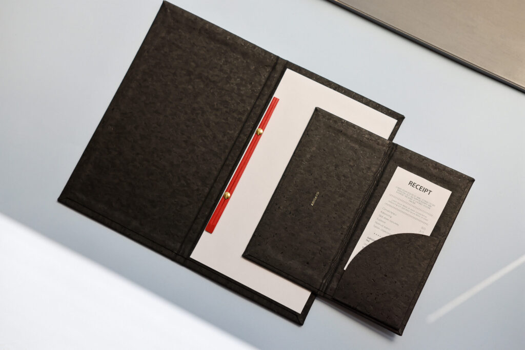
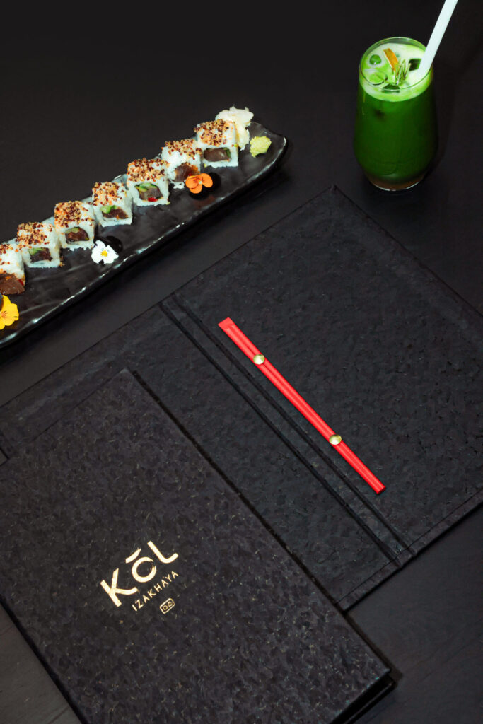
The brief was clear: all black, austere, considered. Nothing unnecessary. We answered with black cork.
Cork is one of the most remarkable materials in our collection. It is naturally water-resistant, with a warmth and resilience that no synthetic material can fully replicate. In its black form, it becomes quiet, serious, beautiful. For KōL, we produced two pieces, a menu cover and a bill folder, both in hard-format black cork, both finished with the KōL logo in gold foil. The contrast is everything: the matte depth of the cork, the clarity of the gold.
For the menu cover, we introduced one final detail. In place of conventional binding, the pages are held by a pair of chopsticks. It is an unexpected touch and entirely the right one for a restaurant rooted in Japanese culture.
The Visit That Closed the Circle
Once the products were delivered, our team visited both restaurants to walk alongside the staff, to show them how each piece should be handled, cleaned and maintained and to see with our own eyes how everything settled into the spaces Andria and Alexis had so carefully built.
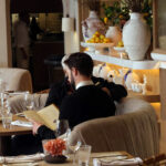
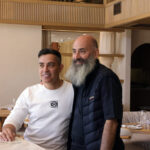
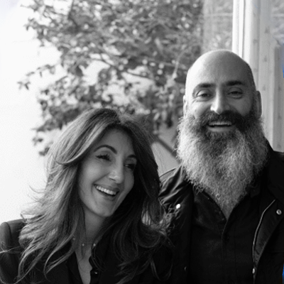
Your creativity, professionalism and attention to detail made the entire process seamless, and the final products beautifully reflected the vision and identity of both our restaurants Mila Modern Greek and KōL Izakhaya Japanese.
Andria Neophytou
Co-Founder at Philotimo Group
Andria Neophytou | Co-Founder at Philotimo Group
Are you preparing a rebrand, a new opening, or simply ready to elevate your table experience? Come and visit our showroom. Some of the best conversations start exactly that way.